-
Move from Github to Codeberg
I have been meaning to do this since that fateful day in 2018, when Micros**t bought Github but the introduction of Copilot and its licensing controversy has been the last straw, with many people I follow on Mastodon encouraging others to leave. So I finally put ‘moved to Codeberg …
Read more... -
New eTrex Followup
In my last post, I promised that I would follow up on the pros and cons of the new Garmin eTrex SE vs old Garmin eTrex 10.
Read more... -
Another New Garmin Etrex
Read more...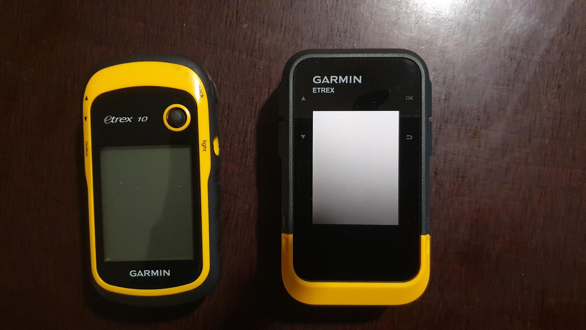
-
Relaunching This Site
With Malte’s help, I’ve finally converted the old wordpress site to a static one. After looking at Hugo, which seemed a bit heavy for my needs and is programmed in Go, which I’m not familiar with, I went in the opposite direction of the Low Tech Magazine …
Read more... -
Gathering plants and fruit with Martin
Read more...
-
Using Spatialite to store and represent our GPX data
A quick bit of background. As people who read this blog know, we have recorded every journey we make, every day, with a GPS since 2003 (Dan) and 2007 (Sophia). As you can imagine, this practice has evolved technologically quite a lot over the decade, not so much because of …
Read more... -
Residency at the Salzamt, Linz
Read more...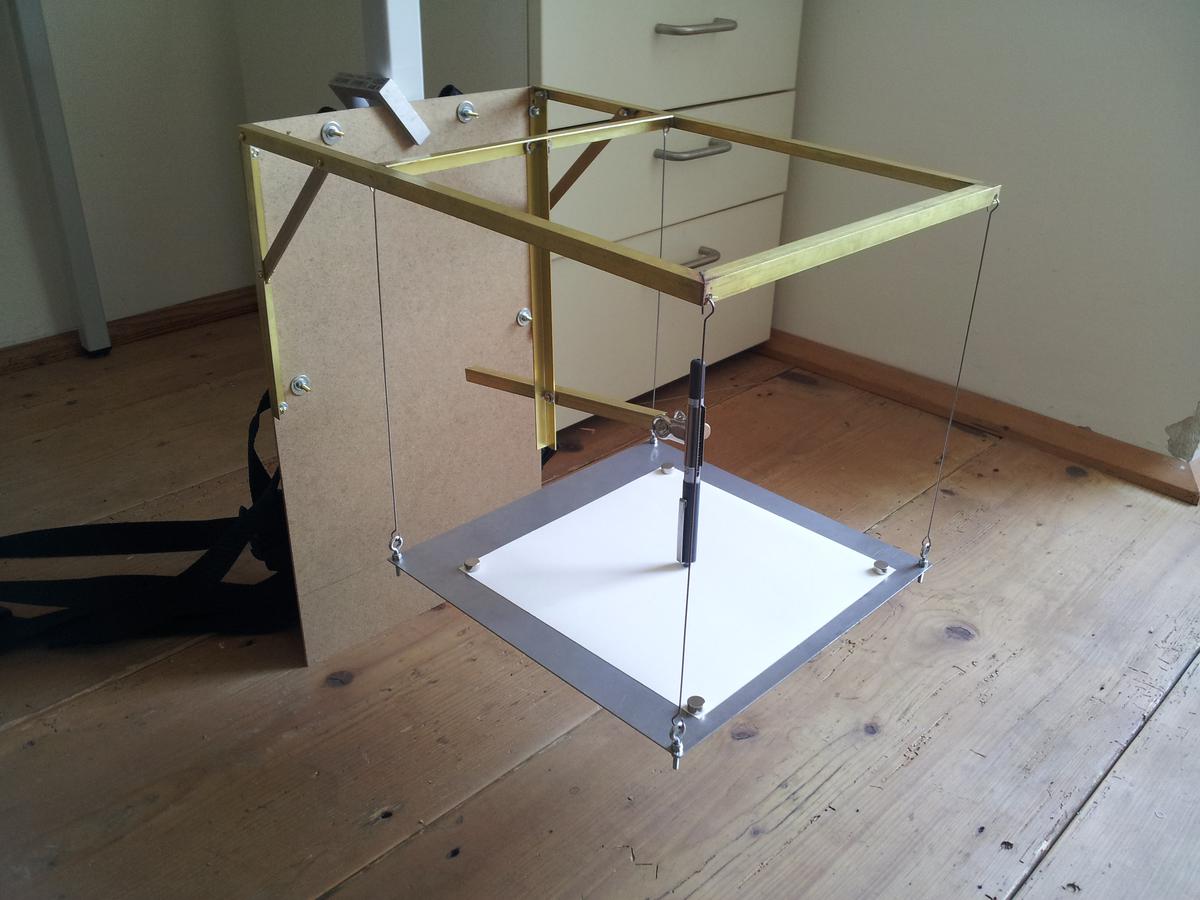
-
Goodbye Jitsi, hello again Pidgin
So the world of jabber communication has been a bit unreliable. After successfully trying a jitsi video conversation at home between my distro and Soph’s ubuntu, I tried to have a meeting with someone I’m mentoring and it totally failed. On agreeing to the call, it would hang …
Read more... -
Goodbye Skype, hello Jitsi
In the spirit of Tino Sehgal, who not only refuses to travel by plane himself, but also insists that the performers of his work don’t travel by plane, I am responding to people who want to Skpe(tm) me by asking them to talk over Jitsi.
Read more... -
CryptoParty Neukölln
When Joseph and Maria from the Slow Tech group came to see Soph and my GPShow at the end our residency at Ausland, they invited us to join them at CryptoParty Berlin‘s next event which was last night.
Read more...