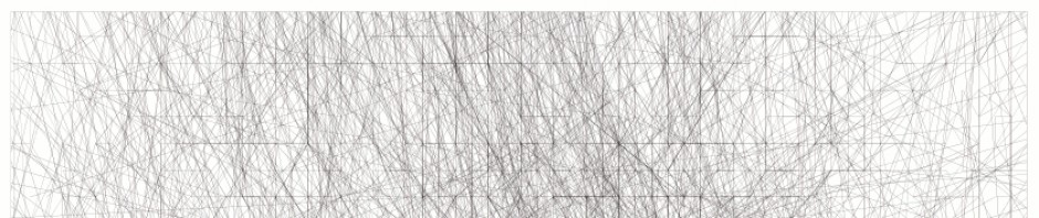
I’ve been experimenting with Mathieu Baudier’s PostgreSQL / PostGIS importer for our tracks (I’ll write about this later soon) and visualising my database of tracks in QGIS. Many possibilities become available. Mathieu’s importer calculates speed for every vector in the database so that you can perform queries in QGIS as well as defining what colour the line is drawn by speed. Here are some early results:

All Journeys in Berlin between April 2003 and June 2010 lines coloured by Speed
In this map, the speeds are split into five different categories and the vectors are coloured accordingly. 0-8 kph being the bright green which is broadly speaking a walking range. Notice also how the road and rail networks declare themselves in blue.

All Journeys in Berlin between April 2003 and June 2010 filtered to show speeds below 6 kph
Here I have performed a query on the database, filtering out all vectors with a calculated speed of more than 6 kph. I find it interesting to see where I walk and it shows very clearly the three places we have lived in Berlin during this time as three thicker areas.